Drawing perspective is considered one of the hardest things in art, except the mistakes usually done are pretty much always the same and can be avoided with a little care. Here 10 of the most common perspective errors anyone on any level of art can fall into.
1. Lines not reaching the vanishing point

Well this is pretty simple to avoid but it’s the most common mistake. It’s probably due to either carelessness or really not having understood the basic of perspective. I encourage you to go back and find some basic tutorial for this.
Anyway, be ALWAYS careful about where to ‘send’ your lines, they NEED to go towards the correct vanishing point or it will just look awkward. Double check if necessary.
And always, ALWAYS use a ruler.
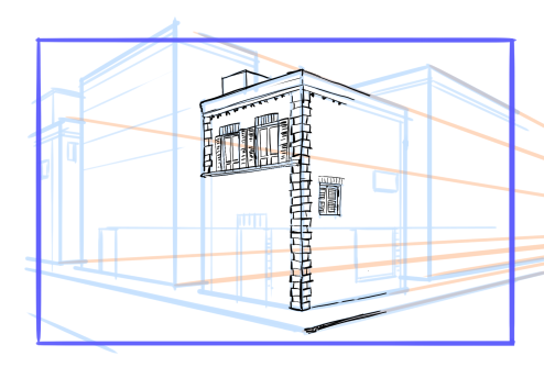
For traditional drawing be sure you have a ruler and be sure to use it for each one of your lines.
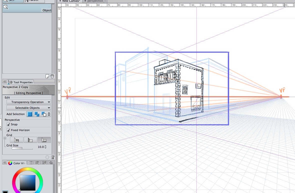
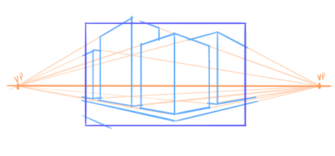
1a. Planes not reaching the vanishing points.
Same thing as before, but very often people send more than one line to the wrong vanishing point.
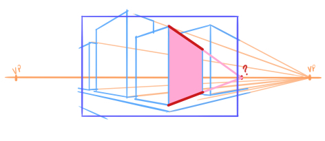
Try to have your lines being consistent and reaching the right vanishing point. If one side of the plane has a different vanishing point from the opposite side the resulting plane will look awkward.
There are of course cases where you need to use different vanishing points purposefully, but of course you have to be consistent with the rest of the shape you’re drawing. I do not want to add to the confusion so I won’t talk about those instances, so my advice is: avoid doing this until you are confident enough to advance your studies of perspective more.
More often than not those mistaken planes reach a vanishing point that’s outside the horizon line. Let’s remember that vanishing points NEED to be on the horizon line.
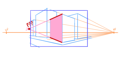
Here’s the correct one
2. Depths
This is an error that EVERYONE will do at the beginning and it’s the first telling that someone is a novice. Actually it’s the most common error I’ve ever seen. (It’s also an error you see in half the perspective tutorials you’ll find online, also an indicator on how you shouldn’t follow that tutorial.)
Objects have depths. These depths needs to be not as long as you imagine it.
This is a cube:

Actually it’s not.
This one is:
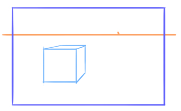
It looks much more like an actual cube.
At the beginning you’ll tend to make depths MUCH MUCH longer than they should be. And this is something you can correct only with exercise and double checking everything.
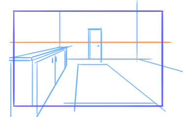
Furthermore, the closest you get to Horizon Line the ‘thinner’ the depth of the object should be.
Not like this:
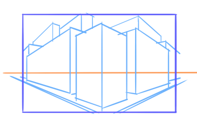
If you walk in front of that building over there you’ll have a Km long building. That won’t do.
Actually like this:
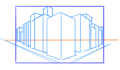
Be always careful with skylines, you’ll tend to draw monsters longer than 10 Km. If it’s a central perspective you can easily draw the skyline with no depth at all like this
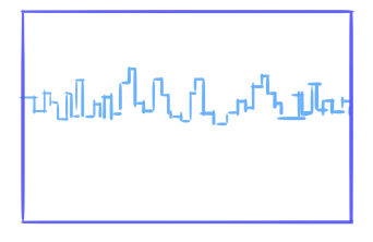
With a 2 point perspective the skyline will need a tiny bit of depth but be careful not to overdo.
The only thing you can do is exercise and exercise and exercise and you’ll get the hang of it.
3. Repeating Depths
Repeating distances are often mistaken by beginners. Because it’s one of the things people think you should do by guessing, the point is that no, it should be done with rulers, otherwise it’ll look weird.
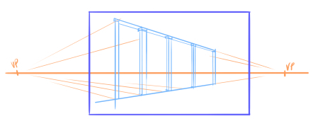
You have to use rulers. These are the steps:
Draw the first unit by guessing the depth
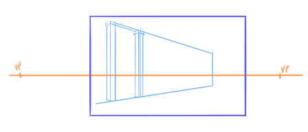 Draw three lines in perspective like this: base, height and exact half.
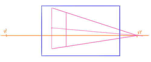
Now a diagonal

Find the new unit thanks to that diagonal
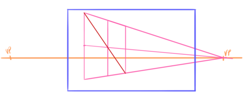
Keep drawing diagonals
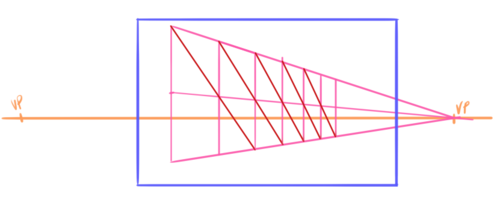
Now use this as a base to draw the rest
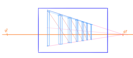
4. Planes tangent to Horizon Line
This is not an error per se, but it’s just ugly to see. Unless you’re doing a geometrical architecture drawing where the exact measurements are important (in that case I’m afraid this is not the tutorial for you) you can change things to help the general image.
Why do this if you can just move the table a bit and or making it a bit taller to make it look better?
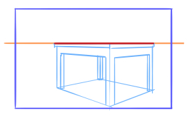
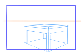
When the planes meet in an awkward way either with the Horizon Line or with each other it look false, it look constructed and honestly it doesn’t help composition one bit.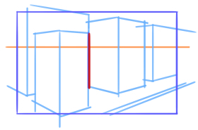
The drawing is yours, you decide what to do with it, you are not forced to put that table there, if you need to then change it.
5. Lines with no width variations
Another thing that help a lot in giving a sense of depth is variating the width of the inking (or pencil) lines. Closer objects with wider lines and objects far away with thinner lines. It’s simple.

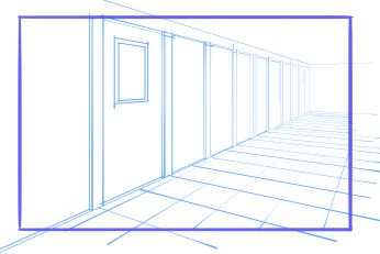
The first one catches your eyes to the far point where all those lines go and make a mess, the second one gives you a sensation of depth.. The ink help perspective a lot.
6. Patterns and details going on towards the infinite
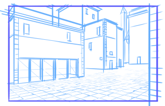
This point reconnects to #2, things get smaller when you approach the H.L., why would you keep drawing those tiles forever?
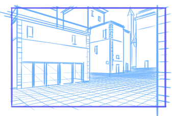
They tend to distract the eye and it just becomes a big horrible black area while probably your focus for the image was elsewhere. This is something I see a lot with bricks on the walls. At a certain point drawing every single detail hurt the drawing, so you should stop.
The best thing to do is to artfully lower the details level. This is difficult most of the time because you need to tune the amount of details with the image and it’s something that will come easy with time and exercise.
Also details on repetitive objects need to have a lower definition while approaching the Horizon Line, you can’t keep drawing ever single decorated nook of those windows:
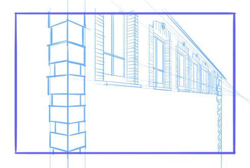
It is better to simplify. For example you don’t have to repeat all the details in the bricks for all the windows. Just removing that alone you image is much less of a mess.
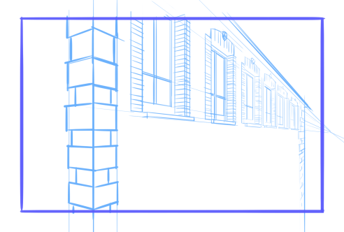
Using thinner lines (see previous point) of course help a lot.
7. Objects with no depth and finishings
Another error that look really bad in illustrations and comic pages is when things have no depth and finishings.
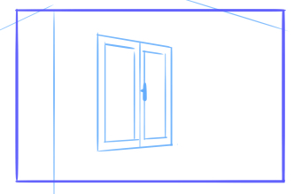
I can understand rush and I understand that perspective is long and boring but you can’t do things half-way, it will look weird. Windows and objects are not cardboard cutouts they have depths!
The way to correct this is using references. Go find a real life one, or a photo, or google it.
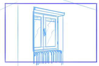
Have fun with the details, give life to your drawings!
I can understand that different people have different styles but more cartoonish kind of drawings still need a base in reality, and a realistic preparation cannot do anything but help the artist.
8. Central perspective exaggerated
Well, just don’t do it.
If you need to draw a widespread panel just use 2 points perspective.
Central perspective has limitations, and those limitations are: if you bring objects too far the measurements gets weird.
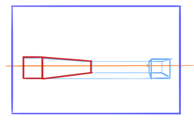
9. Misplaced Vanishing points and exaggerated perspective
While there are some masters that can exasperate perspective to create really dashing images those are people who have a deep understanding of every rule of perspective and know when to break them. If you’re reading this tutorial chances are that you are not one of those (as I’m neither) so you definitely should avoid doing this.
Placing vanishing points too close or inside the panel/illustration will result in awkward things.
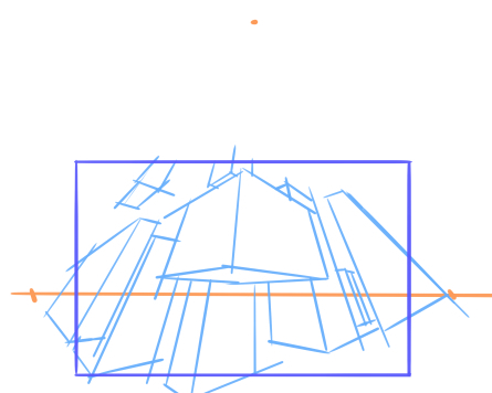
Well, no.
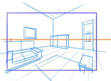
And anyway you’re not required of drawing everything, if you notice that keeping drawing towards the borders makes the perspective look weird you’re allowed to crop the drawing there and end the panel or the illustration. You don’t need to keep going on to the infinite, ok?
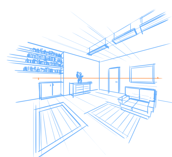
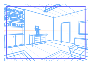
You are allowed to crop.
I’ve treated how to place vanishing points in another tutorial you can find here.
10. Characters not in perspective
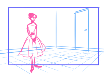
Well, characters need to fit an environment as well. You can’t have tiny people next to a gigantic door.
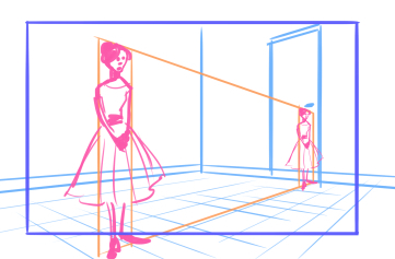
Be always careful about proportions.
As well as that you need to be careful with relationships between characters as well, characters far away need to be put in relation with characters in front.
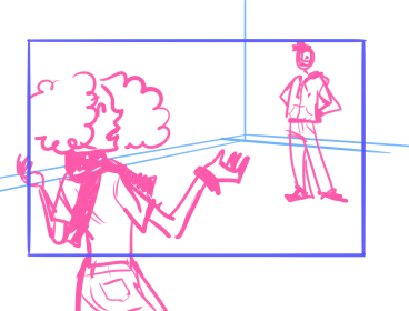
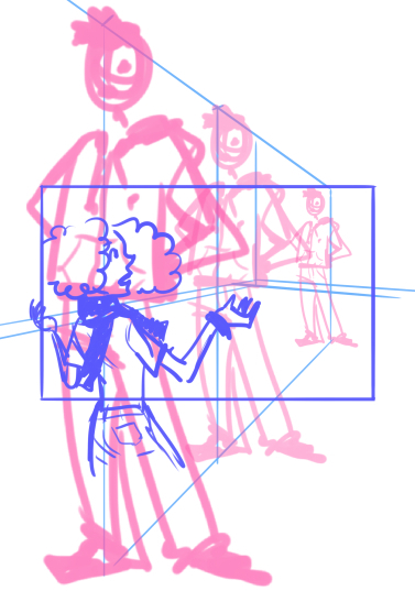
Be careful about this. And if you need, help yourself with perspective lines so you can understand the size of your characters. But this is another thing that will come easy only with exercise and making mistakes again and again and again.
If you want more informations about characters in their environment I made another tutorial about that here.
That’s pretty much it. Actually the most common are without a doubt the first two points, work towards correcting those two and you are already halfway there.
If you are interested in the subject of perspective I have a tutorial about placement of the vanishing points here
And a video about the perspective tool in Clip studio paint and MangaStudio5
