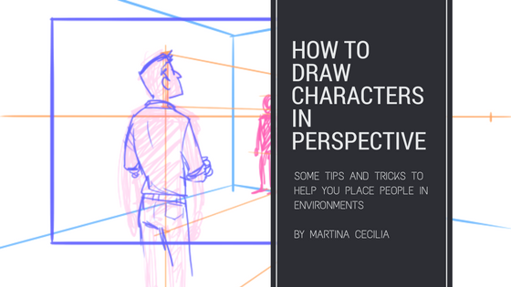
Regarding the other tutorial about common perspective errors I published here I received a request from vanillafrappes15 on tumblr:
Could you further elaborate on drawing characters in relation to each other? The box technique doesn’t really help me, but it makes more sense to apply that to backgrounds.
Ok this is one of the things that will get better with exercise. I’m not even that good at it myself if I have to be honest. Let’s see if I have a couple of tricks that could help you anyway in the beginning.
Doors.
Doors give you the scale. Doors and handles tells you how big is your environment.
Seriously. These are two walls ok?
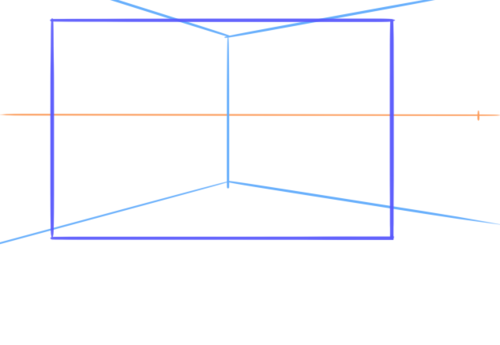
Just drawing two different doors they become two different rooms.


Now add the door handle, you still get different rooms of different sizes
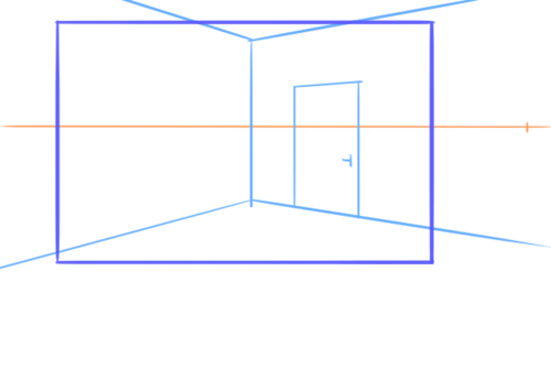
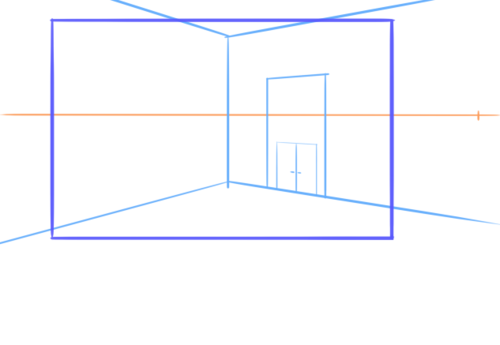
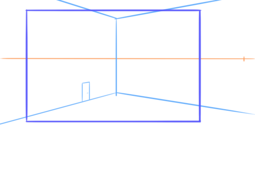
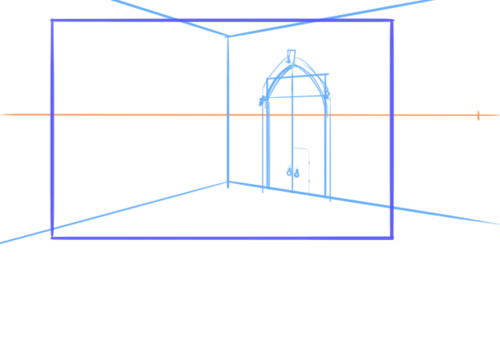
Now we have the scale of the room, you don’t even have to draw it in the final art, you can delete it later and use it now just to understand. Doors are usually 2,10 or 2,20 m heigh (anyway, just slightly bigger than 2 m) and the handle is usually 90 cm from the floor.
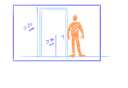
Given those measurements you can sort of understand how big is a person related to the door.
The handle is around the general area of the hips. Of course here you have to sort of understand how tall your characters are, but a general idea it’s there and you don’t have to be mathematically precise in this job.
So, we know how big a person should be in relation to the wall, now we can bring them to the foreground and find out how big they should be.
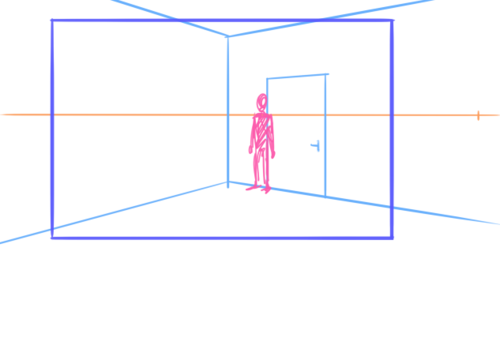
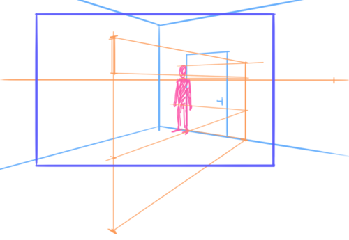
And then draw the rest.
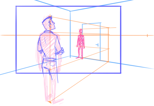
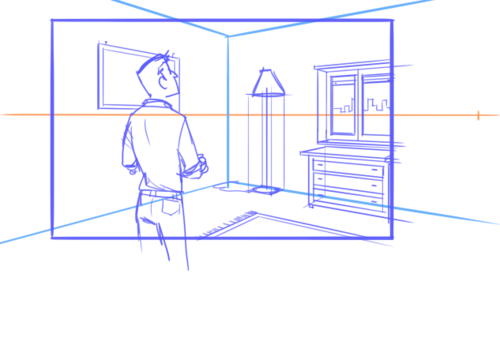
You can use this for exteriors as well, there are doors there too. Or anyway, draw one just so YOU can understand the scale and then erase it.
The other way around
Doing it backward might be a good idea. You can draw the two characters and then find the horizon line and the vanishing points.
Something like this, this is a panel:
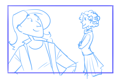
Of course you don’t see the rest of the characters, but you can sketch their heights. More or less they should be something like this:
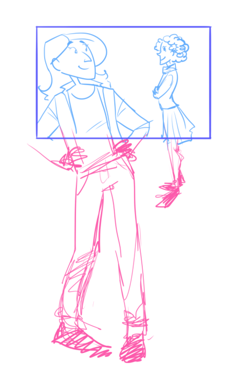
Now we have their heights, let’s pretend they have the same height (characters in a background is really not an exact mathematical science, you can round off the measurements.) so lets draw perspective lines and find the intersection.
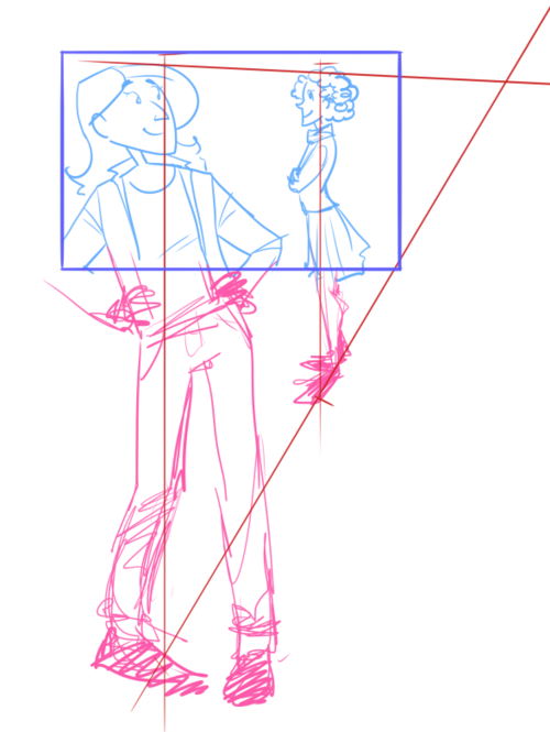
Yeah, that’s our vanishing point, or at least one of them, and of course we have our horizon line as well since vanishing points are always ON the horizon line.
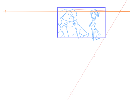
You can place the other vanishing point with your sensibility and then draw the BG
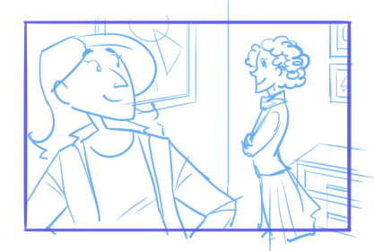
Notice one thing…
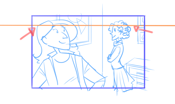
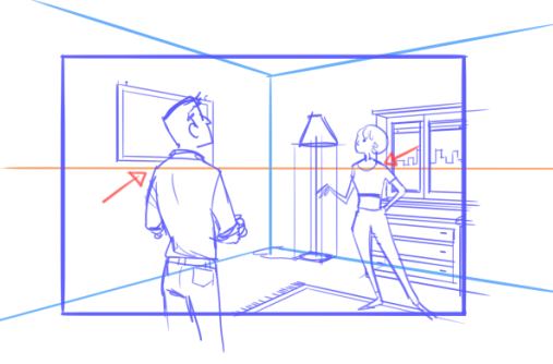
The Horizon line will always intersecate characters of the same height in the same way:
If one character meet the horizon line at the head all the other characters will do the same.
And by the way
At last there is one great rule in narrative drawing it is good to have in mind constantly: it doesn’t matter if it’s correct and it follows the rules, if it doesn’t look good and it doesn’t work to help the image then it’s wrong.
Look at the image, if it really doesn’t work and yet is perspectively correct CHANGE IT. If it look weird and if it undermines the meaning of the image you should definitely change it.
The rules are there to help you make good art, not to hinder you.
the rest of the tutorial about perspective errors is here
