and use perspective to help storytelling.
first published on my deviantart account
People who know the basics of perspective but are still at the beginning often find themselves in doubt in front of a white canvas on where to place vanishing points.
There’s no real rule here but I can give tips that can help make a decision. Of course the more you’ll practice the more it will come natural to you.
1 point perspective
The natural instinct here is to place the horizon line and the vanishing point in the centre.
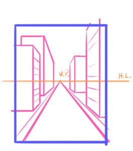
There’s nothing wrong with it but you may want to save it for particular cases because it has the tendency to make the scene look static.
Save for cases where symmetry is a necessary part of the image This is to be avoided as it will not help you in making your composition varied and interesting.
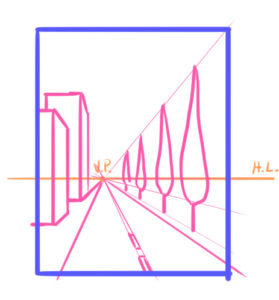
If you move slightly from the centre both the horizontal line and the vanishing point the image will look more natural.
Natural is good.
Natural is what you look for 99% of the times.
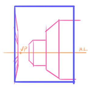
Be careful not to move the vanishing point too much, you risk a weird false perspective.
Keep it still in the central zone but not at the very center and stay clear from the borders of the image.
But this is not really an error, it will just make your life harder because things close to the border are more difficult to draw in a way that’ll look good.
1 point perspective is an easy and straightforward way to bring the focus on the central area. so it’s a useful tool in composition. the eye will be automatically drawn toward the vanishing point.
2 Points Perspective
The same concept we applied on 1 point perspective we can bring back here.
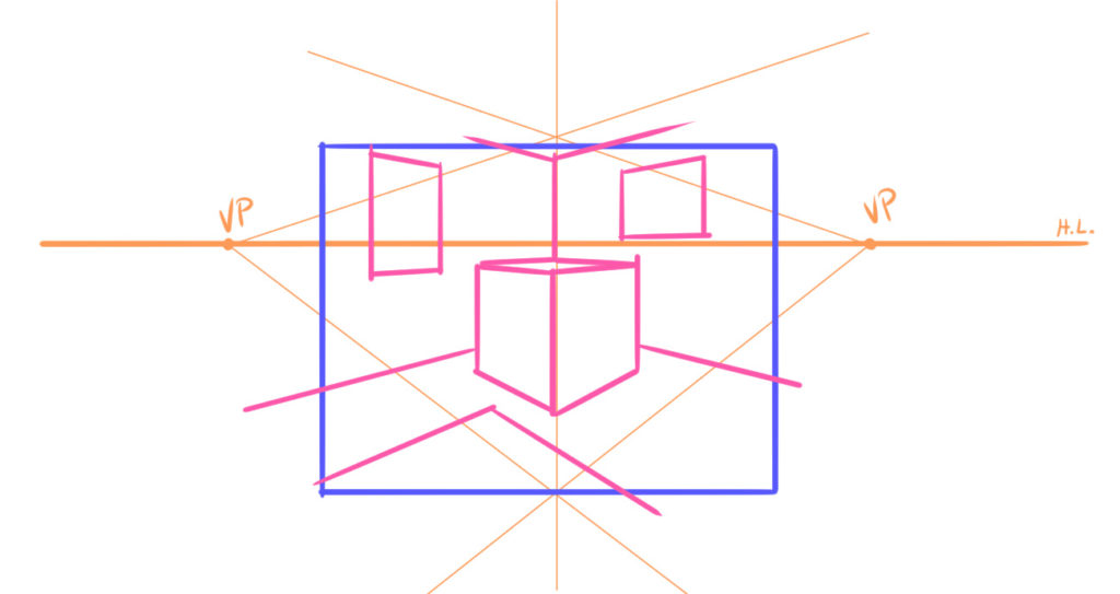
Try to avoid symmetrical placing of the vanishing points, it will NOT help you in making a natural looking environment.
It will instead make your illustration look like a technical drawing.
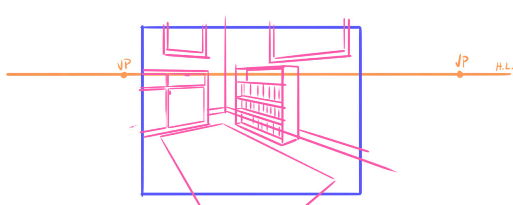
You may want to alternate the vanishing points. as you can see here one is closer to the edge of the canvas and the one is farther away.
Yet again moving things from the center help you give a natural feeling to the image.
The distance of each vanishing point has much to do with field of view and lenses effects. The bigger your field of view the closer the vanishing points and viceversa.
So if you need to have an effect like fisheye lens you’ll have to put vanishing points quite close to each other.
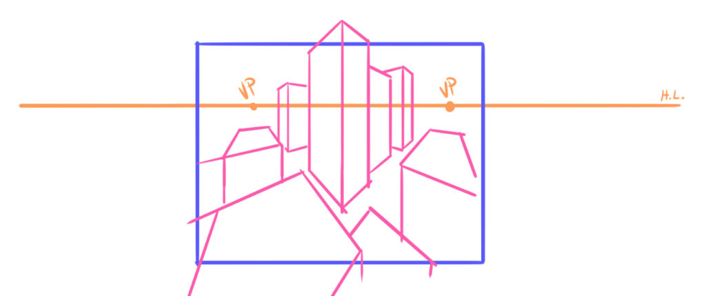
In any other case this is to be avoided. you can look yourself that this doesn’t look good at all.
I don’t really know what application this might have, maybe something that’s supposed to be shown through a door’s peephole? That has a curve component as well though.
So, first rule of a natural looking 2 points perspective is to place the vanishing points OUTSIDE the canvas. (or panel)

There is such thing as too far in 2 points perspective. Lines have the tendency to be almost horizontal.
But this is definitely less problematic than having your perspective as strange as the previous one.
So if you are in doubt it’s better to place them as far as possible.
Now that you know where not to place vanishing point I should talk about where to actually place them.
Except there’s no rule, it’s mostly your own judgement and you get that only with practice.
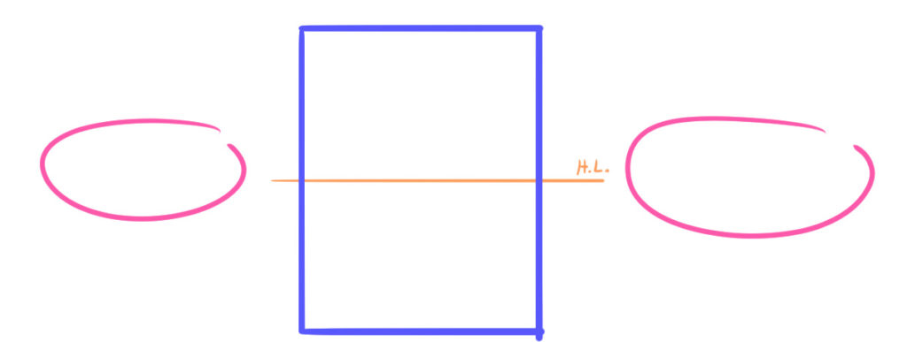
I can say, if you need help:
outside the canvas, not too far but still not just immediately outside the border of your panel, no more distant than the width of your canvas.
But as I said is better far away than too close.
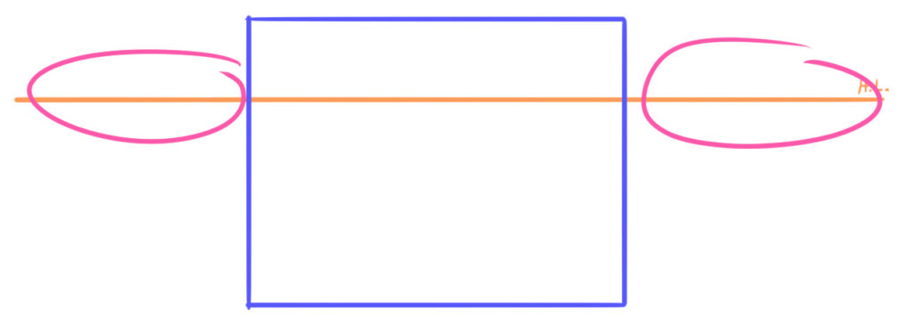
The images show a vague area you can follow at the beginning until practice will teach you the best way.
Of course you can always do the reverse thing. Draw a rough idea of your perspective. Drawing it by hand will help you find a natural angle. (this is a room and 2 walls.)
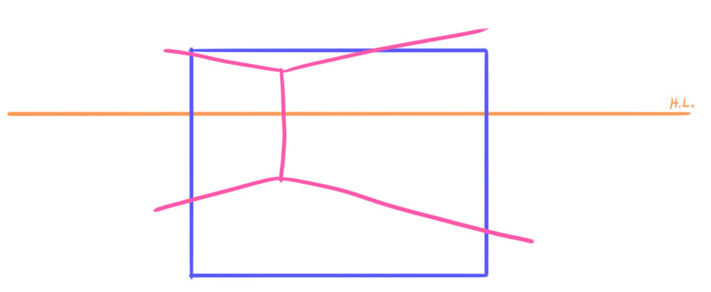
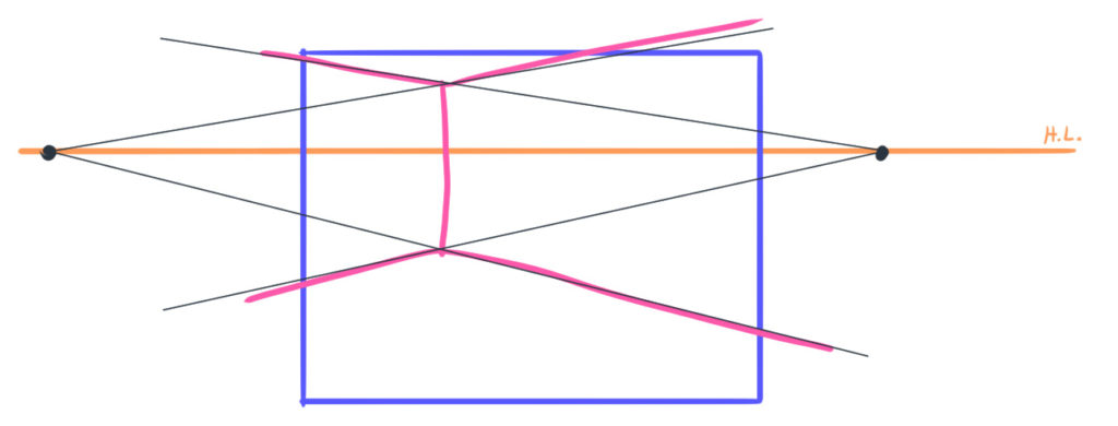
Now draw the lines until the horizon line and find the vanishing points.
Even if your drawing is not precise don’t worry, you need this only to give you an idea.
Two points perspective is used in the majority of cases, because you’ll use 1 point perspective only when you directly face a wall and that doesn’t happen a lot.
So if you need to draw anything this is the most obvious choice.
3 points perspective
Given that the 2 points laying on the horizontal line follow the same “rules” of the 2 points perspective I’ll focus only on the placement of the third vanishing point.
In this case there’s no “too far”. You could happily approach the infinite if that was practically possible (actually the absence of the 3rd point in the perspective means that it is infinite!).
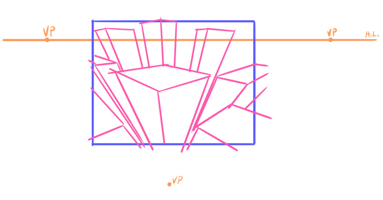
A closer vanishing point will mean that you’re looking downward more.
Except there is a point where the perspective will just look awkward.
To avoid this is better to place the point far away.
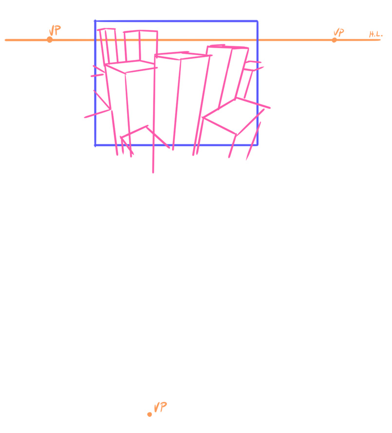
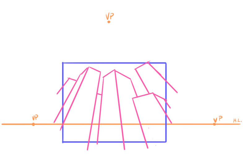
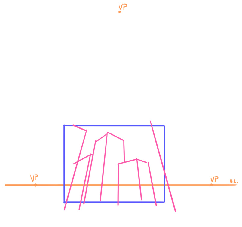
The third vanishing point can either be under the horizon line or over it.
If you place it under the horizon line it will look like you’re looking down, if you place it over the horizon line it will look like you’re looking up.
Of course this force you to see the horizon line accordingly. If you look down it means you’re higher up and you’ll have a high horizon. And viceversa.
You use this kind of perspective only in big spaces (better if outside). It’s useful for cities and to show impressive architectures. If used correctly this is a great thing for storytelling.
If you place the 3rd point below you can use that to give a perspective of height, if you need to draw an abyss or something that goes down and down and down. If you place the reader in a high cliff you will give him a sensation of dizziness. On the other hand if you place the 3rd point higher up you’ll make the reader feel small and make the place you’re depicting look majestic.
Place the Horizon Line
The Horizon line’s placement helps in thousands way but many people never really focus on this.
The Horizon line represent your point of view (POV). It should be placed at about the height of the viewer’s eyes. This can give a lot of different sensations if used correctly.
Look at some examples:
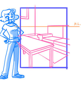
an adult will have a different perspective from a child
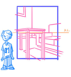
a child might not be able to see the top of the table and everything looks scarier and taller
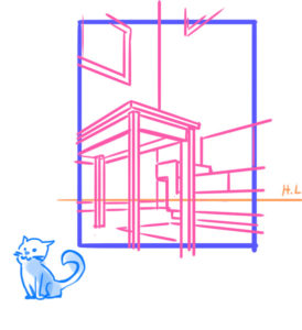
a cat will have another perspective as well
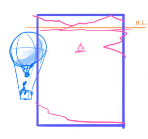
from the sky you might be able to have a huge view of that lake…
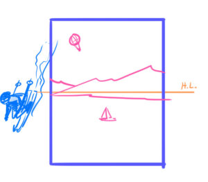
…a view that you might not have if you are skiing on the mountain
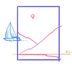
but look at how much of the sky you can see from the boat’s view
Ask yourself what to show, do you want the reader to identify with a kid? You may want to lower the Horizon line. You want to estrange the reader from the scene like he’s looking from the outside in? Or you can choose a really high horizon line like you’re looking from above, or choose the point of view of a cat, like the viewer is intruding in a scene.
The possibilities in here are endless and those are just few examples.
More experimentation on the horizon line
to add to experimentation you can also have an horizon line that’s not parallel to the base of the panel.
A tilted horizon line can accomplish several things.
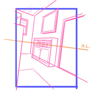
The dutch angle is something that is used a lot in cinematography.
The image becomes unstable giving a sensation of uneasiness and anxiety.
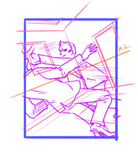
Although action scenes are better with no background at all you really can’t do pages and pages of action with no bg whatsoever.
A tilted horizon line may help here as it brings dynamism to the whole scene.
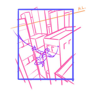
Combine an oblique horizon line with a 3 points perspective and you get spiderman. (no jokes, it’s something that’s WIDELY used on spiderman, it totally gives you the feel of movement and speed combined with New York city’s height)
And that’s it, that’s how you place vanishing points
well, really, it’s not. those are just starting points and some considerations that might guide you to find how YOU can use the perspective to your advantage.
It’s a powerful narrative tool and you should use it to its full potential!
Read about 10 typical perspective errors most beginning artists do.
Other tutorials here.
